Defining Study Parameters
Overview
The Overview page provides a centralized location to specify and build a study. The study parameters (location, date range, and granularity) can be input once, saved, and used for multiple analyses.
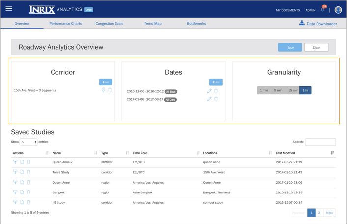
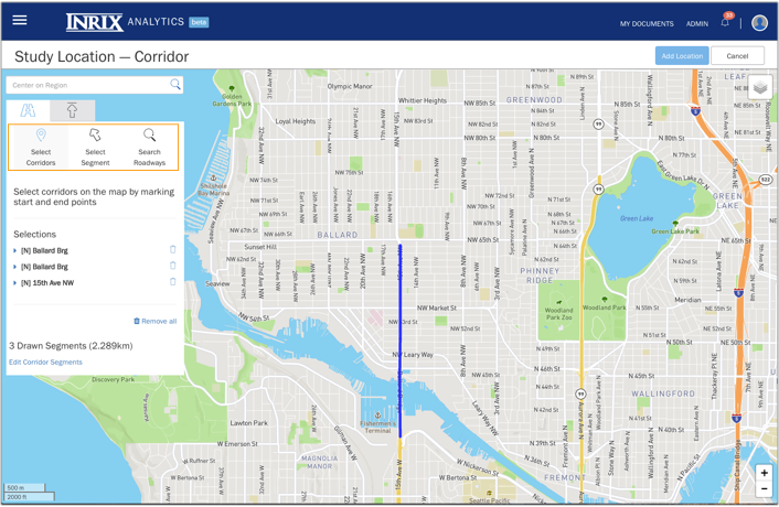
Location
The study location is specified using intuitive map-based selection tools specifically designed for selecting corridors and regions.
Date Range
Up to seven date ranges per study can be easily selected.
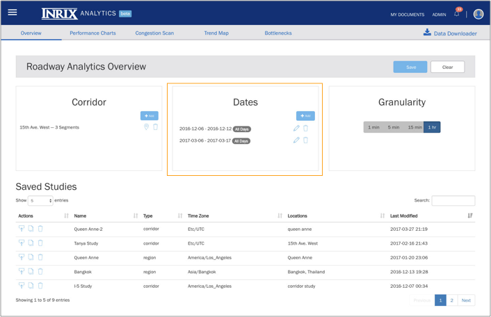
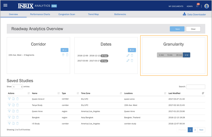
Granularity
The detail level of a study is selected by specifying a granularity of 1 minute, 5 minutes, 15 minutes, or 1 hour.
Producing Performance Metric Charts
Roadway Analytics has three Performance Chart modes:
- 24-Hour (Day)
- Day of Week View
- Cumulative Frequency Diagrams
Performance Charts features:
| Feature | Description |
|---|---|
| Selectable metrics | For metric definitions, see the INRIX Roadway Analytics Data and Metrics Definitions section of the FAQ |
| Chart legends | Toggleable chart legends to enable/suppress display elements |
| Dates | Comparisons of up to seven different dates, as defined in the study parameters on the Overview page |
| Data output | Export of images and raw data for later use |
| Tooltips | Sticky tooltips for convenient in-line analysis of input data points |
| Scaling | Customizable y-axis scale |
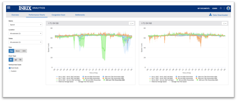
24-Hour (Day) View
View aggregated study data for the minutes in a 24 hour day.
- Chart Modes: Line Chart, Bar Chart, Bot Plot. Note: Box Plots only support metrics with available percentile values (Speed, Travel Time, Comparative Speed, Congestion and Travel Time Index)
- Optional display of Reference Speed and Historical Average Speed chart lines (available for the Speed metric only)
- Line Chart and Box Plot modes support percentile distribution display. The percentile values are populated by the minute-level data for each metric
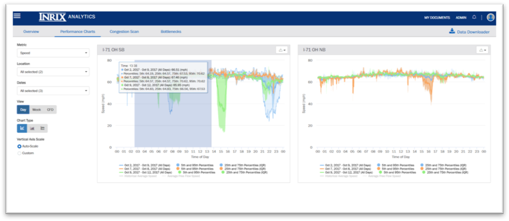
- Zoom in on a specific time range within the 24-hour day by clicking and dragging from left to right on the chart
24-Hour (Day) View with Percentile View
24-Hour (Day) View – Zoom Selector
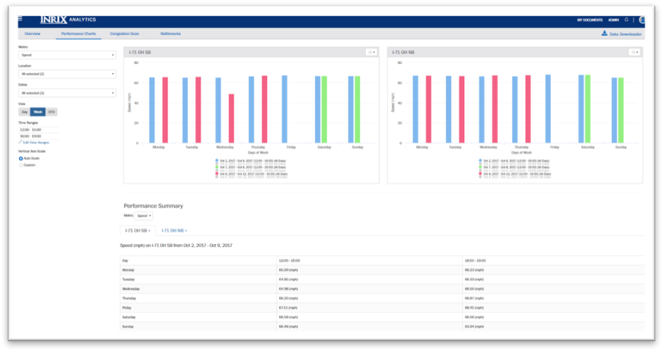
Day of Week View
View aggregated study data at the day of week level.
- Time of Day selector supports convenient study definitions for comparison of different time ranges for a given location
- Summary table that displays values for each metric and time period selected
Day of Week View with Performance Summary Table
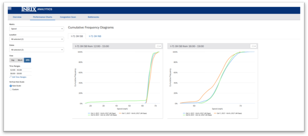
Cumulative Frequency Diagrams
Shows percentages of data value counts.
Metrics supported: Travel Time and Speed
- Time of Day selector supports convenient study definitions for comparison of different time ranges for a given location
- Note: data counts are the sum of the minute-level values for each metric.
For example, if a single corridor is studied for the period of 7:00AM - 10:00AM over a date range of 5 days, 900 values will be reflected on the diagram (180 minutes per day * 5 days).
Cumulative Frequency Diagrams with multiple time ranges
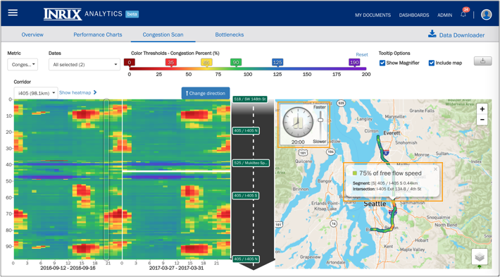
Analyzing and Illustrating Corridor Congestion
The Congestion Scan tool helps to visualize and pinpoint locations on a corridor that are underperforming and to compare them over time. Available metrics are speed, historic average speed, travel time, travel time index, buffer time, buffer time index, planning time, and planning time index.
This tool supports comparisons of up to seven different dates as defined in the study parameters, allows the user to customize the time range and color thresholds, and includes the ability to export images for later use.
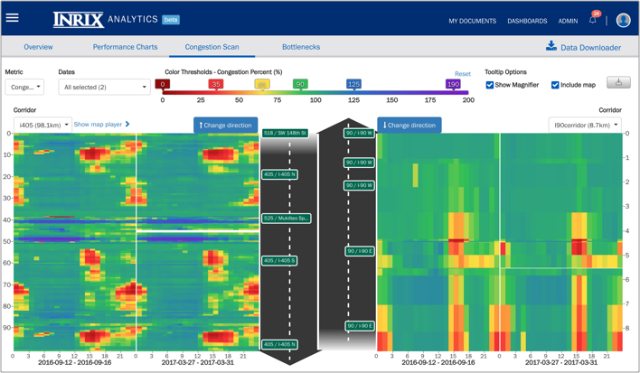
Map Player View
- On the Congestion Scan tab, click ‘Show map player’ above the left-hand heat map. This gives a map-based view of the left-hand heat map. The player changes map segment colors based on the data for that time of day.
- A vertical bar on the heat map reflects the time of day that is displayed on the map player. You can manually update the location of the vertical bar.
- The clock control on the map player has pause as well as a faster/slower control.
- Tooltips are available by left-clicking on any segment in the map. Also, the map is zoomable.
- To view the map player for any corridor in the study, select the corridor on the left-hand heat map.
Identifying Recurring Congestion and Bottlenecks
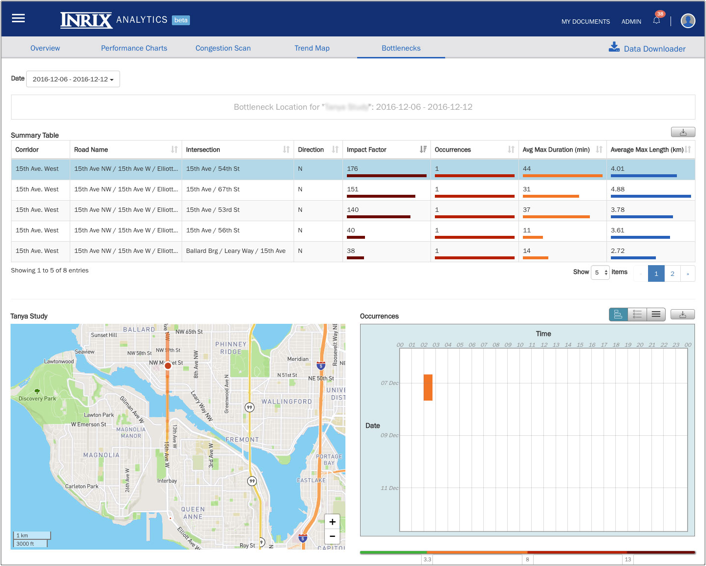
The Bottlenecks tool identifies locations of recurring congestion and quantifies attributes of the resulting bottlenecks. Bottleneck attributes are average maximum duration, average maximum length, number of occurrences, and impact factor, which is the calculated product of the other three attributes and is used to rank the bottlenecks.
Bottleneck locations and attributes are displayed in a table that can be sorted based on any of its fields. Users can also selectively view the bottlenecks on a map and visualize them in chart form.
Downloading INRIX XD Traffic Data Reports
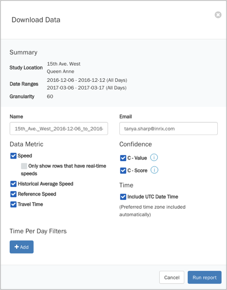
The Data Downloader feature provides complete access to all of the data that has been licensed to a user and facilitates analyses in addition to what is included in INRIX Roadway Analytics.
A user can access the service via the Download Data button on the Overview page and can tailor a request by specifying the study area and data metrics of interest. A report will be generated, and an email can be sent when it is ready for retrieval.
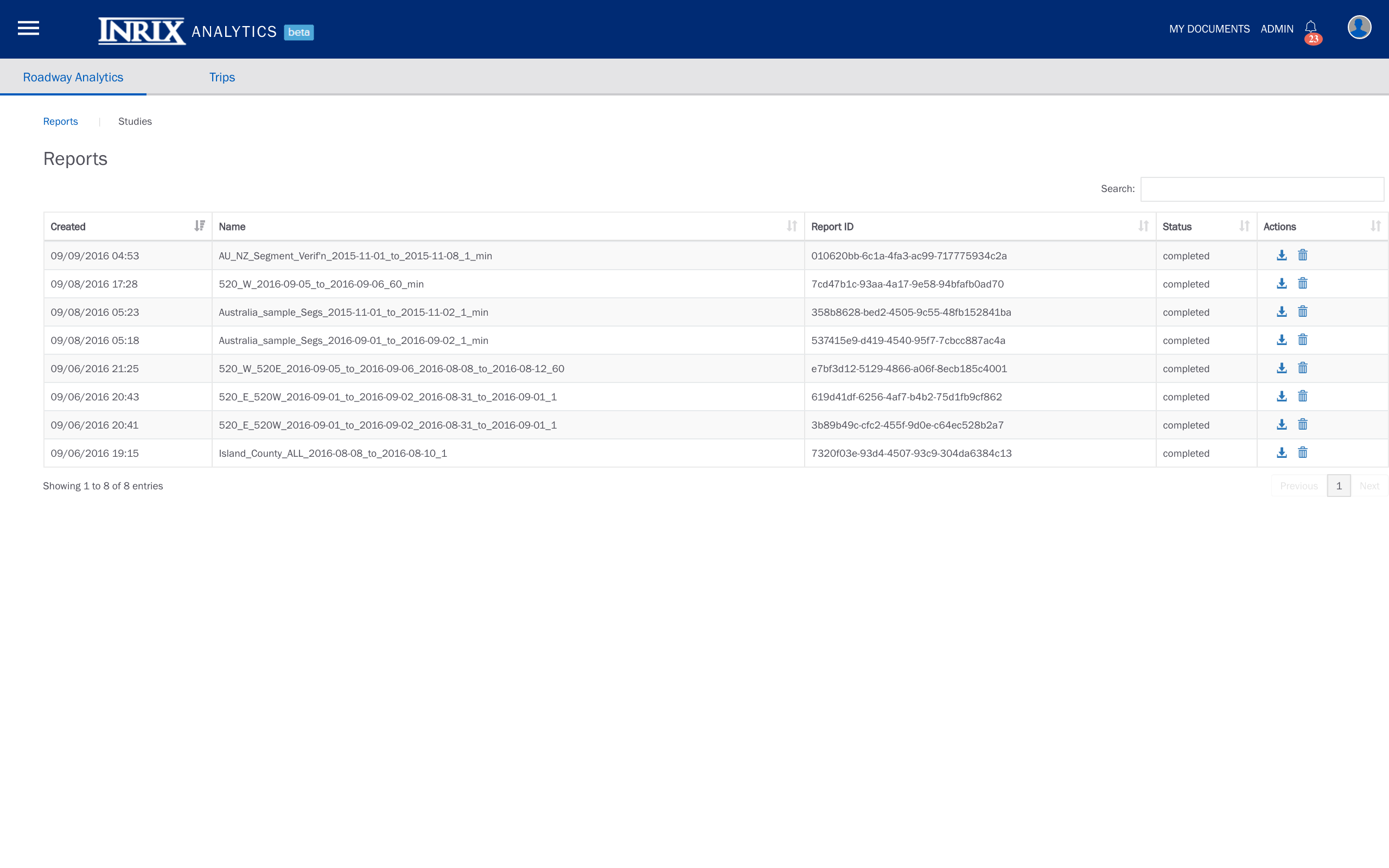
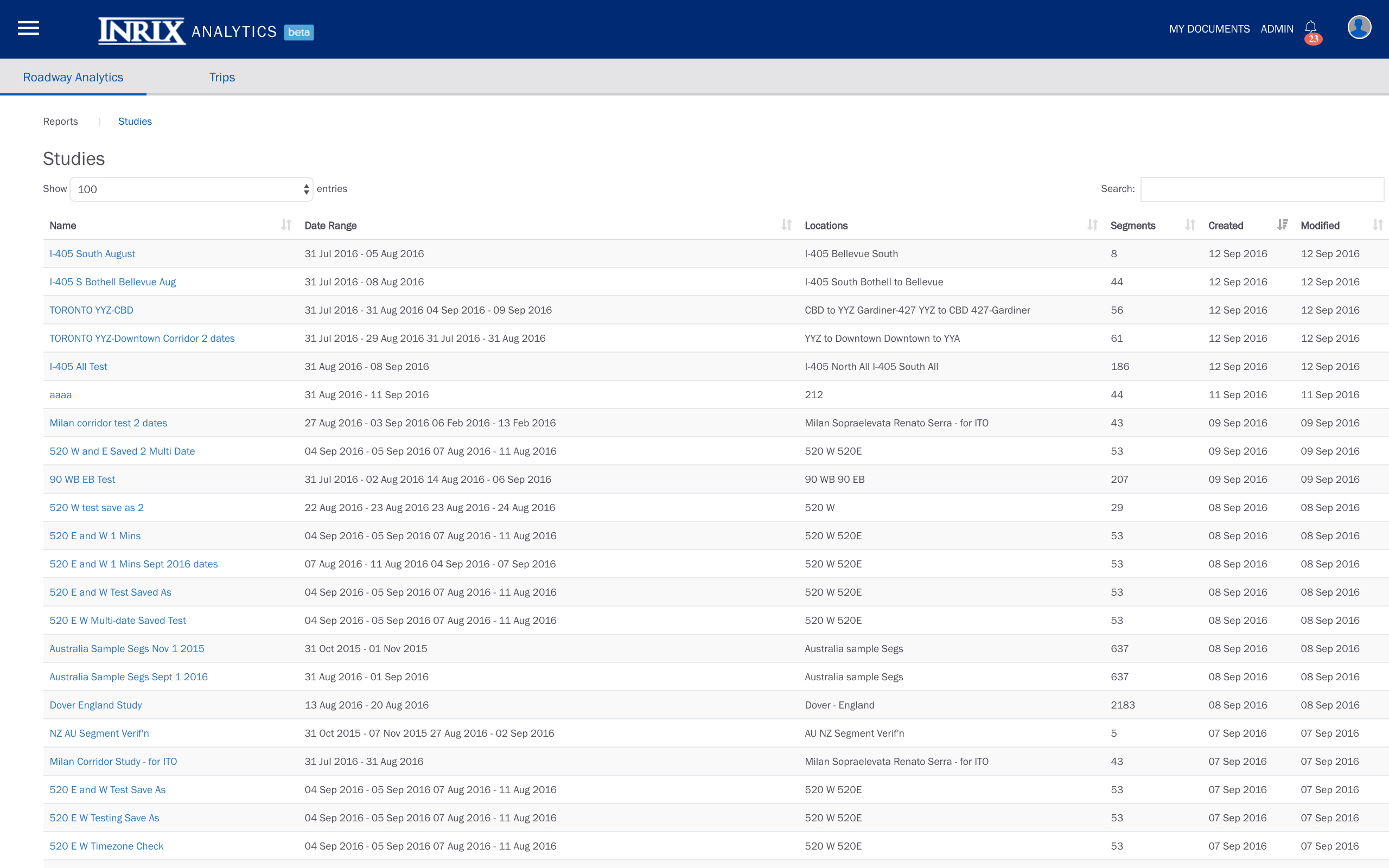
Organizing and Accessing Studies and Reports
From the main Roadway Analytics page, a user can organize, track, and share saved studies, as well as review the status of requested reports and download them when they become available.